Tutorial: Studio Wall Item Adornments
Item Adornments

The "adornments" on photographs, PDFs, video, and text on the Studio Wall refer to various icons and controls you see around the item on the Studio Wall.
-
Comments Icon: In the upper left corner, you will see the comments icon
(
 )
when you're updating the studio wall, but not when you're adding it.
)
when you're updating the studio wall, but not when you're adding it.
If you click this button, you'll open the comments dialog box, where you can view, type, record, or listen to comments. For more information about leaving comments, see the tutorial Commenting on a Studio Wall.
Note that this will display the comments associated with this item, not the studio wall as a whole. -
Rotation Handle: The grey square
(
 )
at the top center of the item allows you to rotate the item. Simply click and drag, and your item will spin in that direction.
)
at the top center of the item allows you to rotate the item. Simply click and drag, and your item will spin in that direction.
-
File Type Indicators: In the upper right corner of the videos and PDF items, you will see an icon to indicate what type of item it is.
 indicates the item is a video.
 indicates the item is a PDF file.
We put these little adornments because you can change their thumbnail so the item looks like a photo, but we want you to know it's different. -
Resize Handle: The grey square
()
in the bottom right corner of the item is the resize handle. You can click and drag this square to make your item bigger or smaller.
-
Hero Indicator: When you see the little blue icon
(
 )
at the bottom center of an item, that item is the "Hero."
)
at the bottom center of an item, that item is the "Hero."
Your classmates will see the hero image when looking at a list of the course studio walls. Photos will display thumbnails as heroes. When you link to videos on certain sites, they'll come with stills from the videos as thumbnails which will display if that video is the hero. Otherwise, a movie camera will display both on the studio wall and on the My Studio Walls or Shared Studio Walls tab if you set it as the thumbnail.
You can set your own thumbnails for videos or PDF files you've uploaded using the context menu (which we will talk about in a little bit).
However, you cannot set a text item as the Hero--so this option does not appear on a text item. -
Label, Rating, Collection, and Flag indicators: Just below the image you
will see a row of icons which show the item's label, rating, collected and flag status.
Later we'll see how you can filter items by these criteria to
control which images are visible.
-
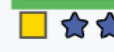 Label: Leftmost is a small colored square which will be white, red, yellow, green, blue, or purple. This is the image's label.
-
 Rating: To the right of the label are 5 stars which represent the image's rating, indicated by the number of stars which are filled in. In this example the rating is 3.
-
 Collection: To the right of the rating is a small circle, which may be filled in. This indicates whether the image is in the current collection (more on collections later): if it's filled in, it's in the current collection.
-
 Pick Status: Finally, the next icon is a pennant or flag, which is either an outline or filled in. If it's filled in the photograph is picked and if it's an outline it's un-picked.
-
Now that we've shown you what you can do with items on the studio wall, let's talk about some of the other buttons and controls on the page, starting with the sliders in the top left corner.